
Shipbao-Redesign
Redesigning a consolidation shipping service application.
Role
Team
UXUI Designer
Solo Project
Duration
Tools
1 Weeks
Figma
Overview
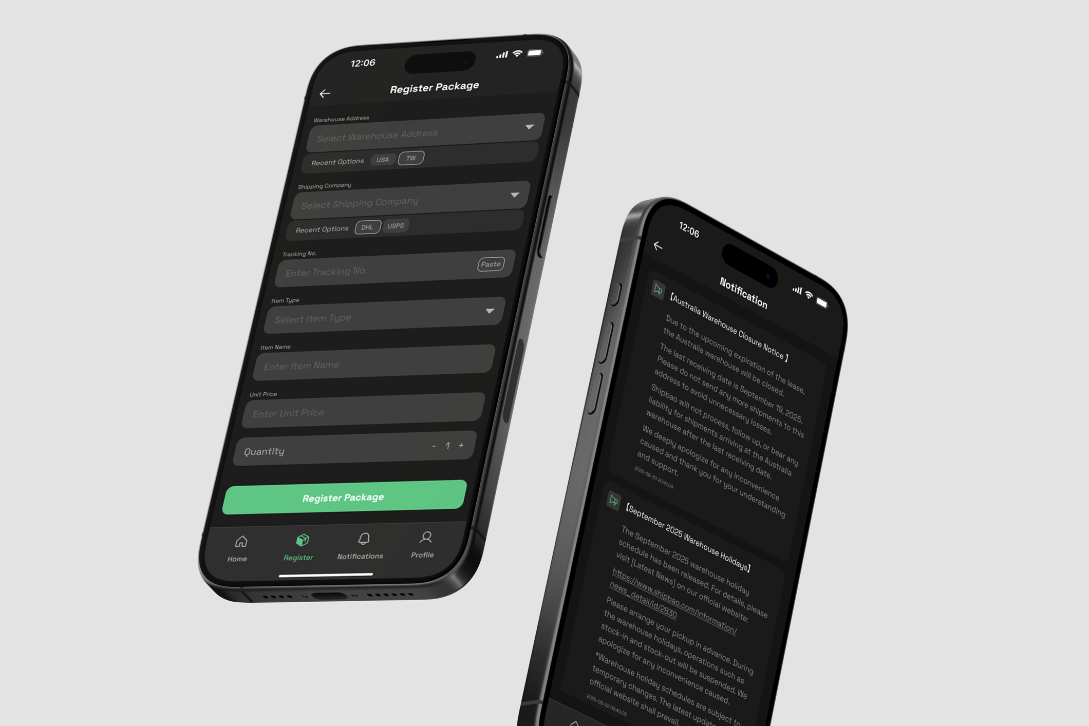
This project involved redesigning the Shippao application, a consolidation shipping service that I have relied on in the past. While I appreciated their excellent service, the app itself had poor usability and an inconvenient user experience.
My goal was to enhance the design, making it easier for users to navigate and helping them complete their tasks more quickly. I also introduced a dark mode to the app.
Research and Problems
While selling film cameras through Carousell/Instagram, I noticed recurring customer frustrations and pain points. These issues led customers to be dissatisfied and confused. Existing platforms didn’t allow me to tailor the experience to my target audience — film photography beginners—prompting me to design a dedicated e-commerce solution.
01
Technical knowledge
Customers lack of the technical knowledge to choose products that fit theirselves
02
Excessive options
User lack the ability to efficiently navigate and filter through too many product choices, leading to decision overwhelm
03
Review dependence
Customers rely heavily on reviews due to a lack of confidence or information to independently evaluate products
Problem
Poor User Experience
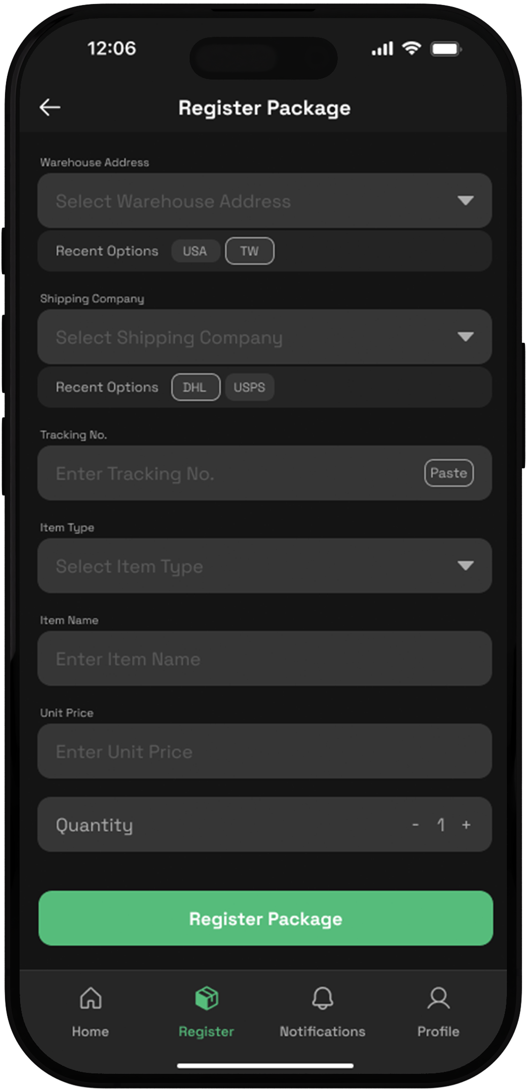
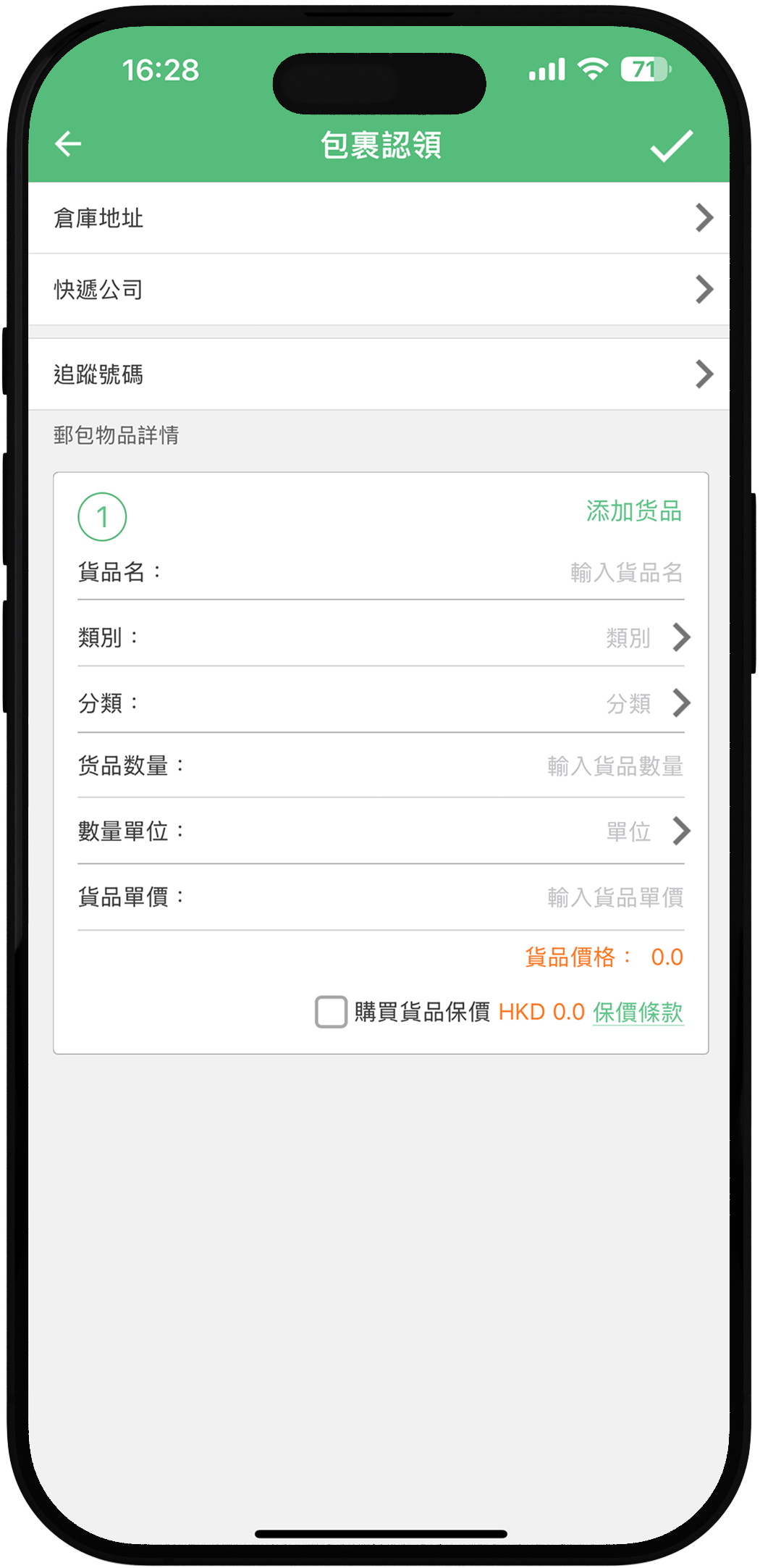
The interface of the original Package Register page was inconvenient to use, requiring excessive time to fill in information.
Solution 1
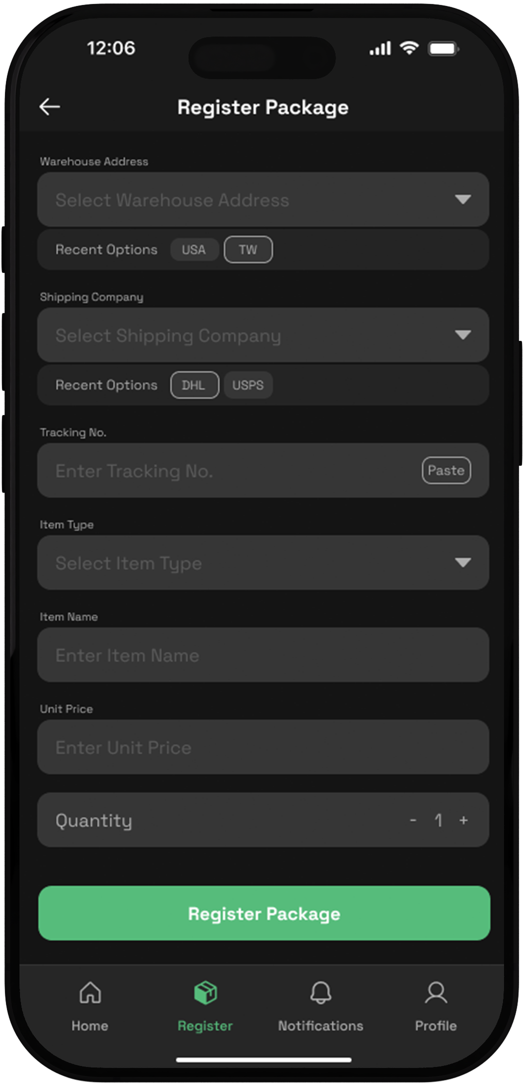
1. The “Recent Options” button is added, allowing users to quickly select their most frequently used choices.
2. Implemented a “paste” feature to simplify the input process
3. Default quantity is set to 1 for user convenience
4. Kept the navigation bar fixed at the bottom of the screen to enable seamless feature switching.
Design Iteration
Problem
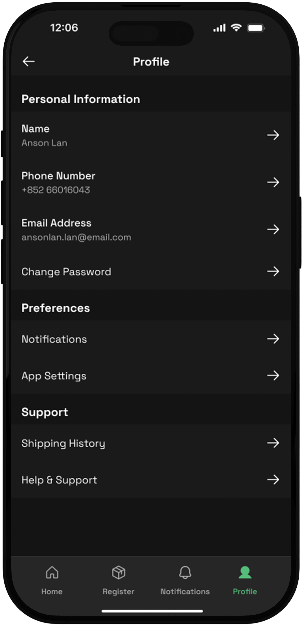
inconsistent
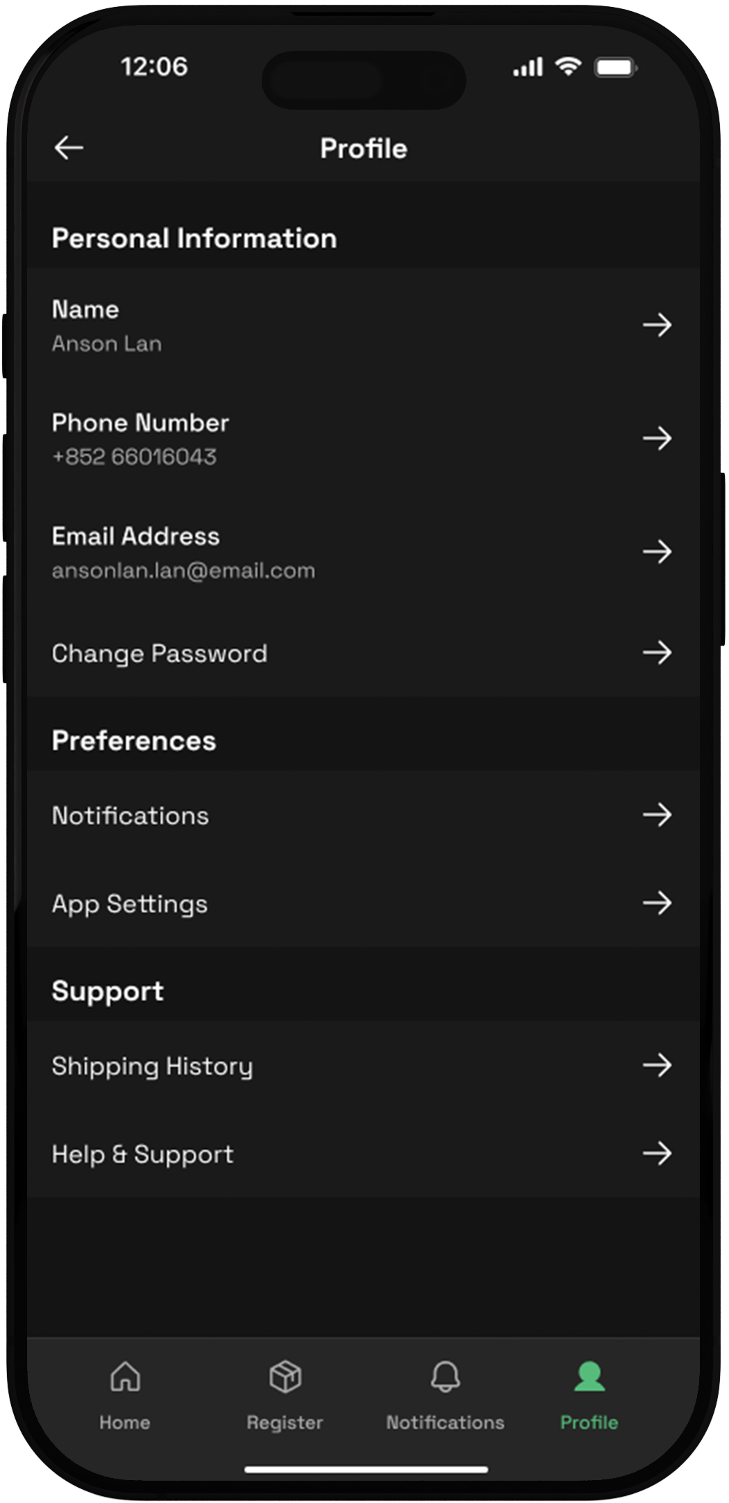
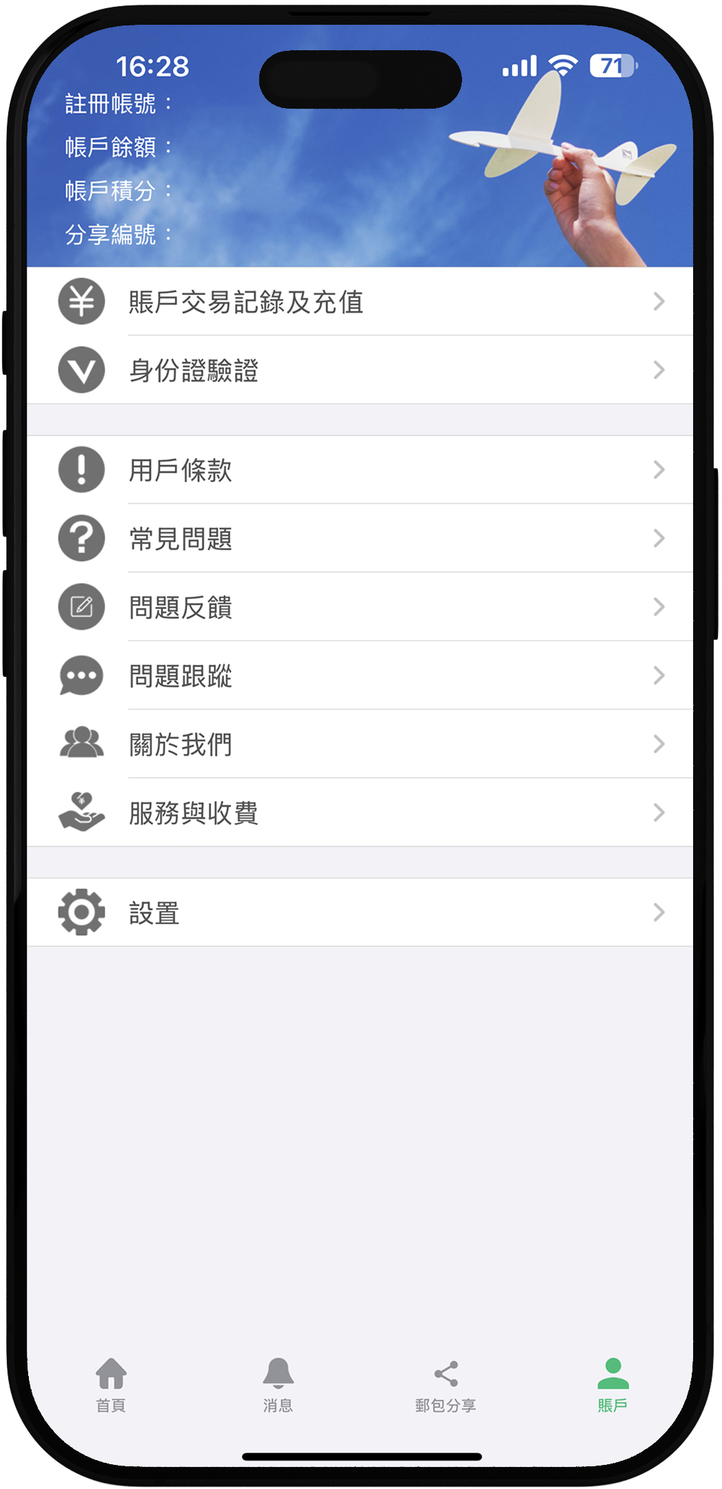
The original Account Page suffered from inconsistent font styles and sizes, creating a cluttered interface. In addition, the categorisation of content was unclear, making navigation confusing.
Solution 2
Addressed visual inconsistencies by revising typography, optimizing spacing and clearly categorizing content to make content easier to digest.
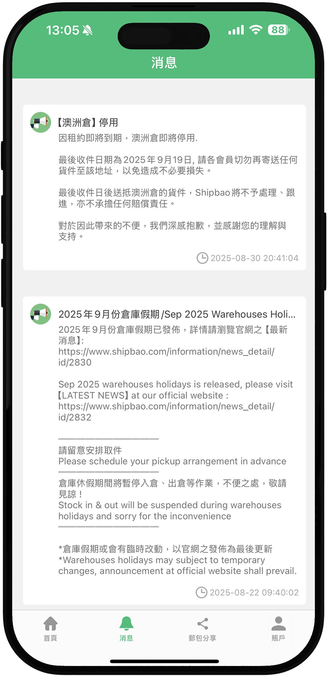
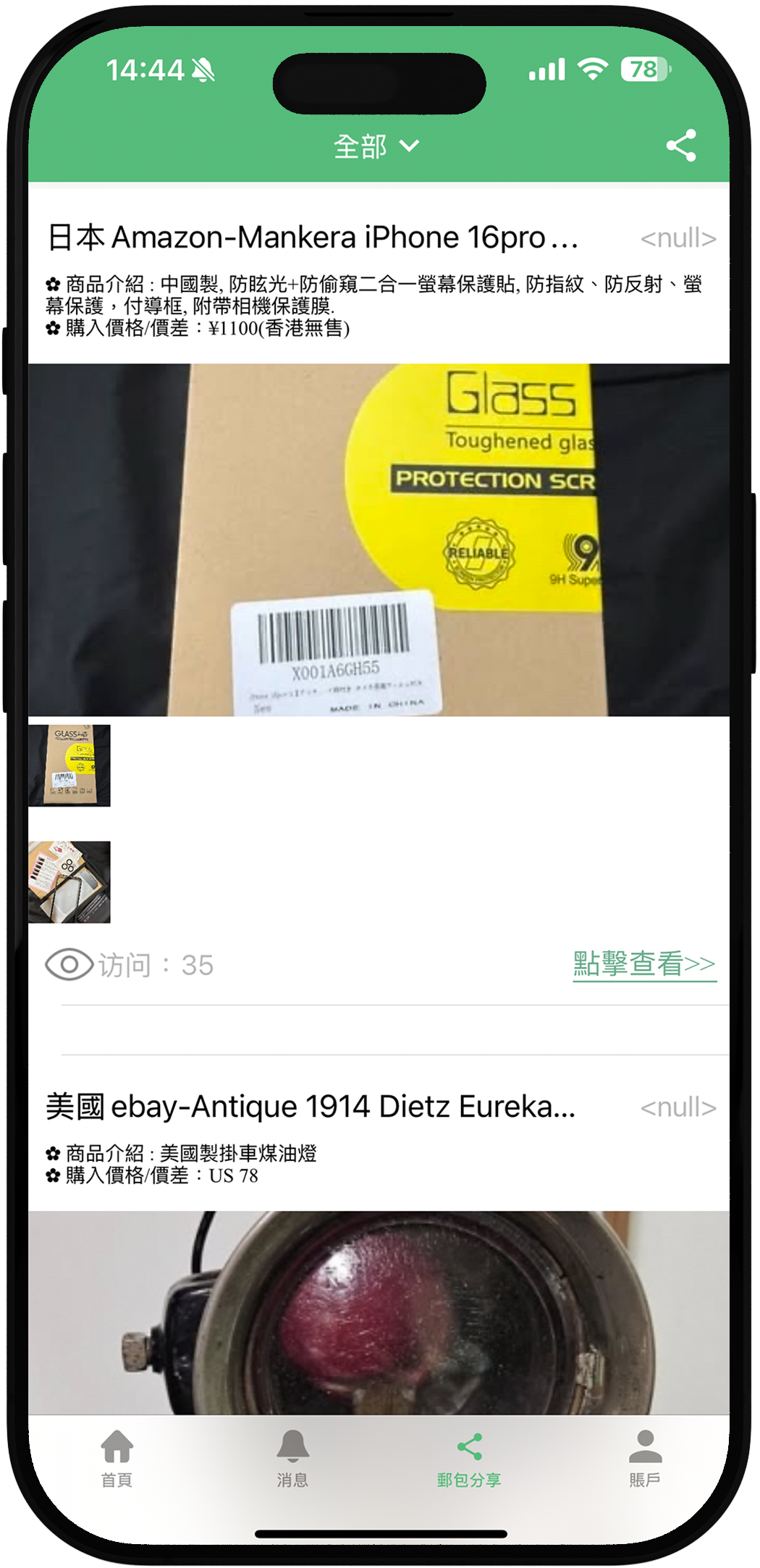
Problem 3
Inconsistency
Customers heavily rely on reviews to make informed decisions when purchasing film cameras. If the review section is not prominently displayed, it’s difficult for users to access and evaluate feedback.
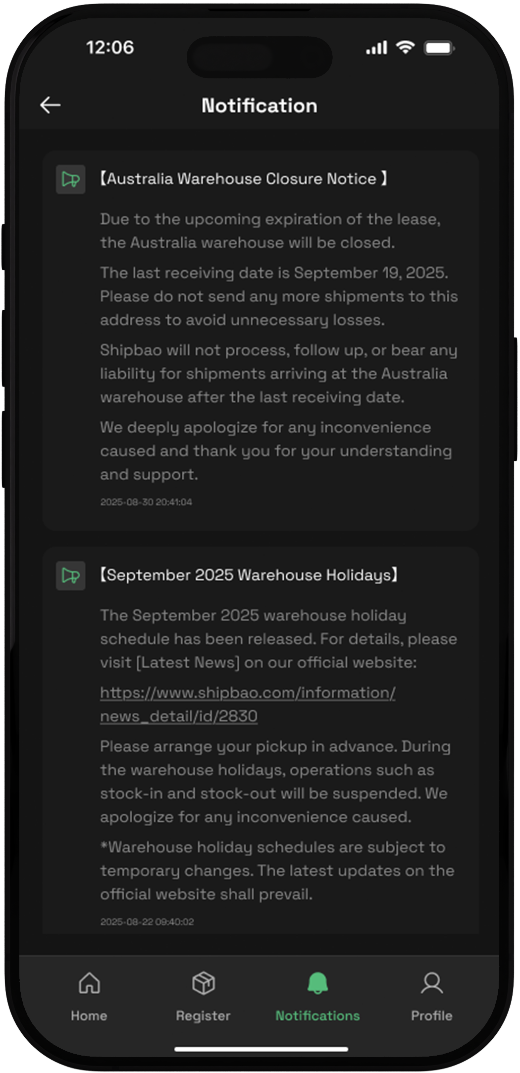
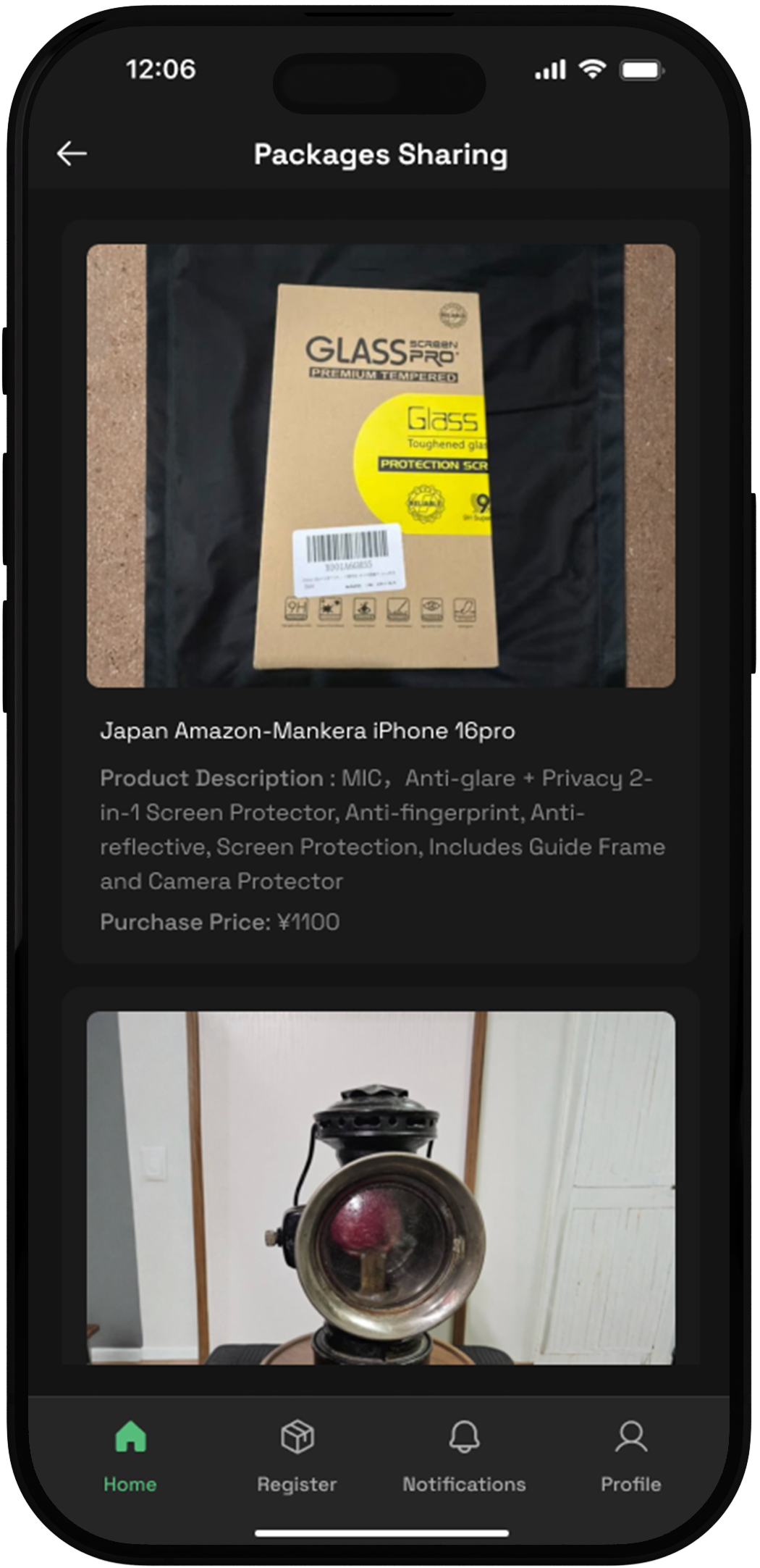
Solution 3
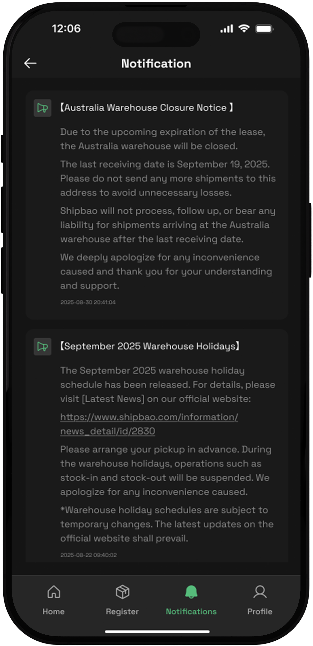
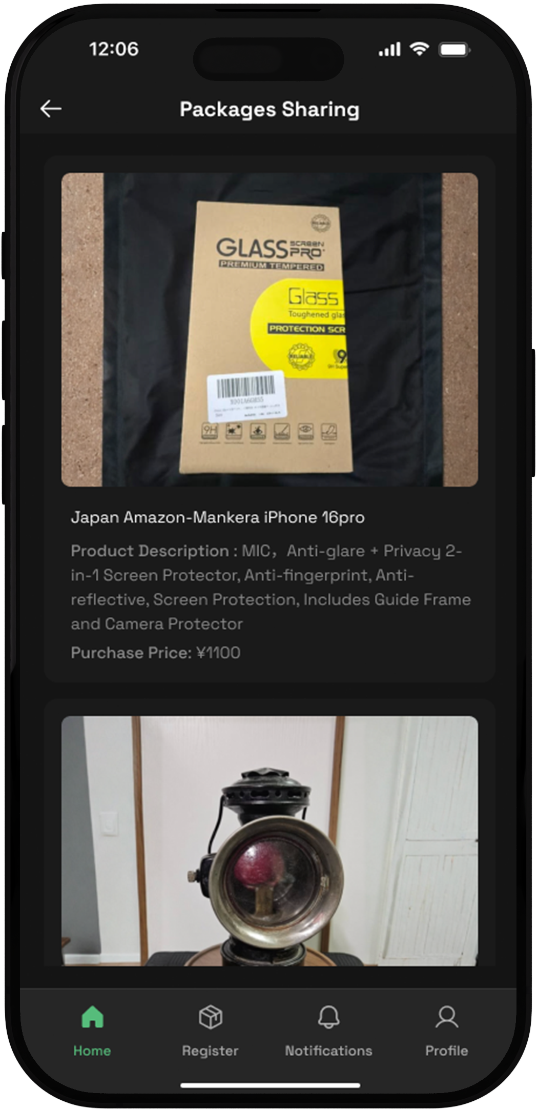
I redesigned the card layout on these two pages to enhance readability and visual clarity, ensuring a more consistent and user-friendly experience.




Takeaways
01
Streamlining User Tasks
By simplifying data entry with features like “Recent Options,” a direct paste function, and default settings, I learned how small design changes can significantly reduce friction and make essential tasks faster and more intuitive.
02
Designing for Clarity and Consistency
Redesigning the Account, Notification, and Product Sharing pages highlighted the importance of typography, layout, and visual hierarchy. I realised how consistency and clarity directly influence navigation, readability, and the overall user experience.